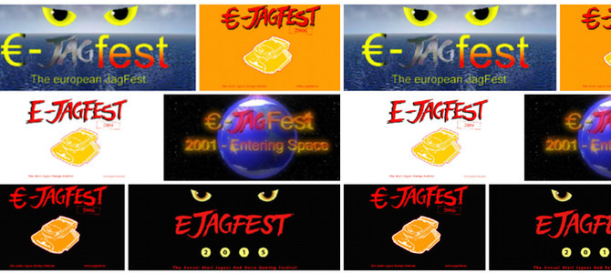
Wir nutzen den Relaunch der ejagfest Webseite um einen Blick zurück zu wagen. Über die Jahre hat das ejagfest verschiedene Logos gesehen. Wir haben alle Logos ausgebuddelt und für euch in einer Galerie zusammengestellt.
Quelle: ejagfest
-
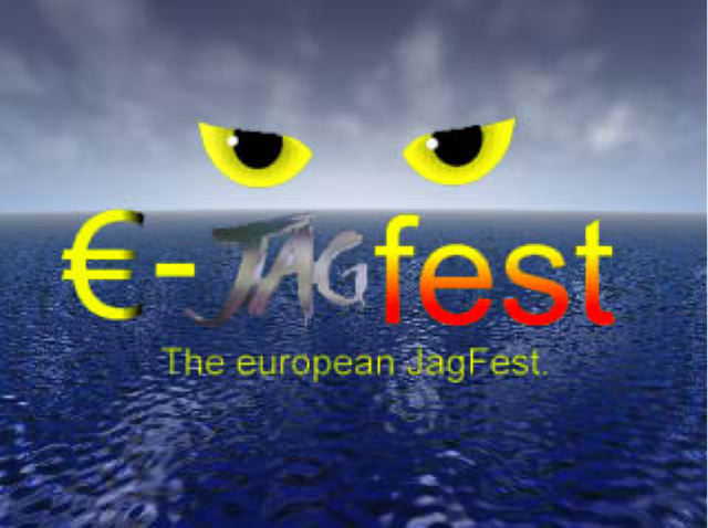
 ejagfest 2000
The first ejagfest logo, created by Lars Hannig.
_blank
-

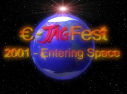 ejagfest 2001
Complete new Logo for the ejagfest 2001. We are entering space. 😉
_blank
-
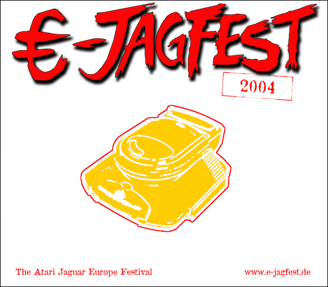
 ejagfest 2004
We had no dedicated logo for 2003, so here is a new one for 2004.
_blank
-

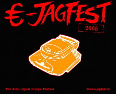 ejagfest 2005
In 2005, we changed some colors. Black is beautiful.
_blank
-
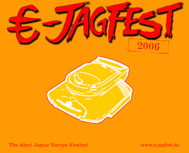
 ejagfest 2006
Another color change.
_blank
-

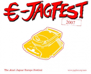 ejagfest 2007
Back to the original design, with a different URL in the lower right corner.
_blank
-

 ejagfest 2008
Same color, with a redesign of the writing.
_blank
-

 ejagfest 2009
Pretty much the same as in the previous year.
_blank
-
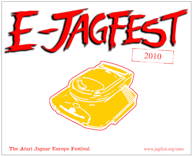
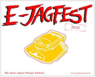 ejagfest 2010
Pretty much the same as in the previous year.
_blank
-
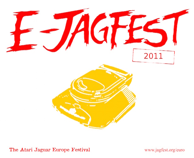
 ejagfest 2011
This time without "outlines" and with a different font in the stamp, but similar to the last years.
_blank
-

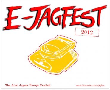 ejagfest 2012
New URL and changed font in the stamp.
_blank
-
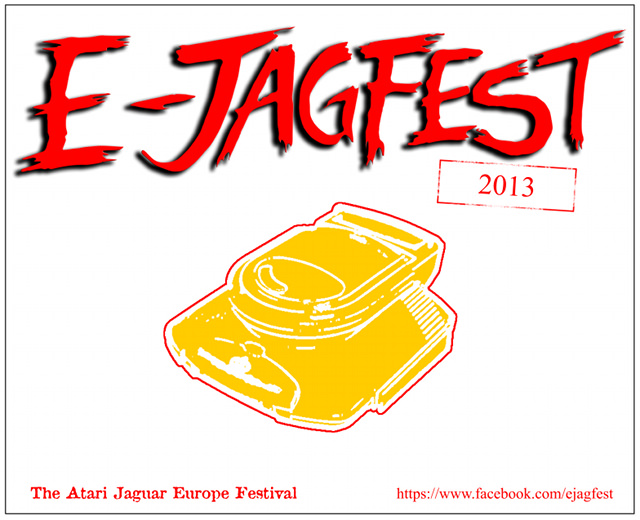
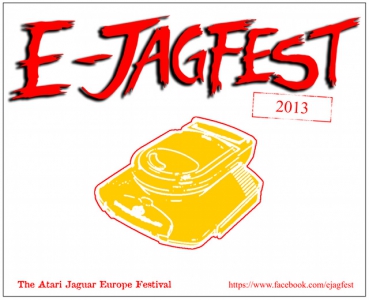 ejagfest 2013
Pretty much the same as in the previous year.
_blank
-
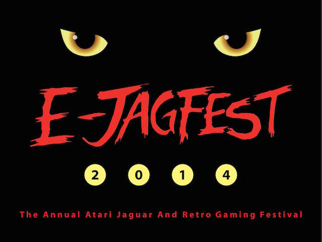
 ejagfest 2014
Major redesign of the logo. Great outcome.
_blank
-
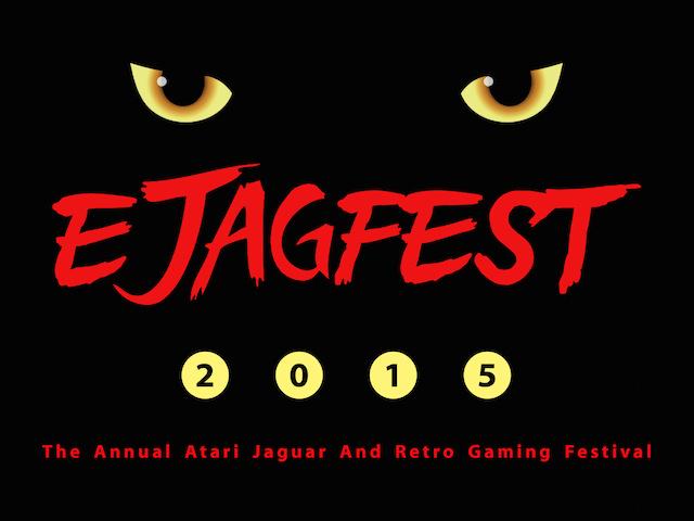
 ejagfest 2015
Another redesign of the writing and the most current logo.
_blank


