We like to use the relaunch of the ejagfest website for a look back.
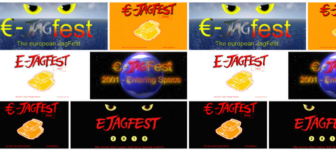
Over the years, the ejagfest has seen many different logos. We have dug them all up and collected them in a gallery for you.
Source: ejagfest
-

 ejagfest 2000
The first ejagfest logo, created by Lars Hannig.
_blank
ejagfest 2000
The first ejagfest logo, created by Lars Hannig.
_blank
-

 ejagfest 2001
Complete new Logo for the ejagfest 2001. We are entering space. 😉
_blank
ejagfest 2001
Complete new Logo for the ejagfest 2001. We are entering space. 😉
_blank
-

 ejagfest 2004
We had no dedicated logo for 2003, so here is a new one for 2004.
_blank
ejagfest 2004
We had no dedicated logo for 2003, so here is a new one for 2004.
_blank
-

 ejagfest 2005
In 2005, we changed some colors. Black is beautiful.
_blank
ejagfest 2005
In 2005, we changed some colors. Black is beautiful.
_blank
-

 ejagfest 2006
Another color change.
_blank
ejagfest 2006
Another color change.
_blank
-

 ejagfest 2007
Back to the original design, with a different URL in the lower right corner.
_blank
ejagfest 2007
Back to the original design, with a different URL in the lower right corner.
_blank
-

 ejagfest 2008
Same color, with a redesign of the writing.
_blank
ejagfest 2008
Same color, with a redesign of the writing.
_blank
-

 ejagfest 2009
Pretty much the same as in the previous year.
_blank
ejagfest 2009
Pretty much the same as in the previous year.
_blank
-

 ejagfest 2010
Pretty much the same as in the previous year.
_blank
ejagfest 2010
Pretty much the same as in the previous year.
_blank
-

 ejagfest 2011
This time without "outlines" and with a different font in the stamp, but similar to the last years.
_blank
ejagfest 2011
This time without "outlines" and with a different font in the stamp, but similar to the last years.
_blank
-

 ejagfest 2012
New URL and changed font in the stamp.
_blank
ejagfest 2012
New URL and changed font in the stamp.
_blank
-

 ejagfest 2013
Pretty much the same as in the previous year.
_blank
ejagfest 2013
Pretty much the same as in the previous year.
_blank
-

 ejagfest 2014
Major redesign of the logo. Great outcome.
_blank
ejagfest 2014
Major redesign of the logo. Great outcome.
_blank
-

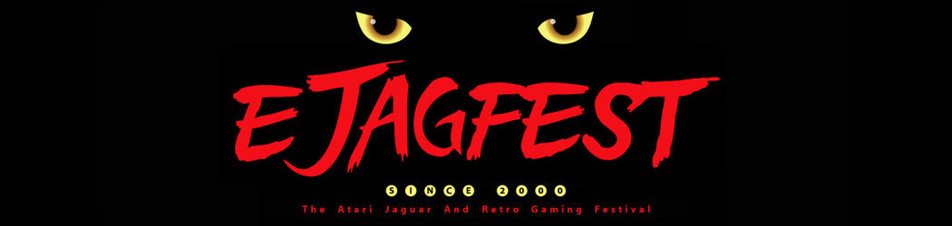
 ejagfest 2015
Another redesign of the writing and the most current logo.
_blank
ejagfest 2015
Another redesign of the writing and the most current logo.
_blank
![]()